Client
Time Out Mag
Time Out Mag
Discipline
Magazine Design
Logo Design
Magazine Design
Logo Design
Sector
Editorial
Editorial
Photography
Ethan Welty
Ethan Welty
With the digital age, travel has become easier and more accessible yet also homogenous. To connect back to it’s non conformist roots, a cover and article layout was designed for Zig Zag Mag, Time Out’s new unconventional travel magazine.


Brand Key Words
Rebellious
Eccentric
Individual
Rebellious
Eccentric
Individual
Visual Key Words
Wild
Dynamic
Dramatic
Wild
Dynamic
Dramatic
Audience
Unique
Curious
Worldly
All ages
Unique
Curious
Worldly
All ages
Inspired by Time Outs covers between the 60s - 80s.
Logo + Type lockup
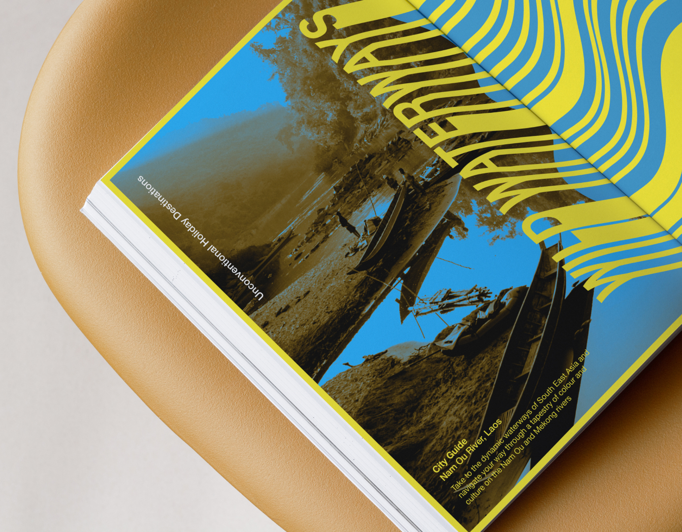
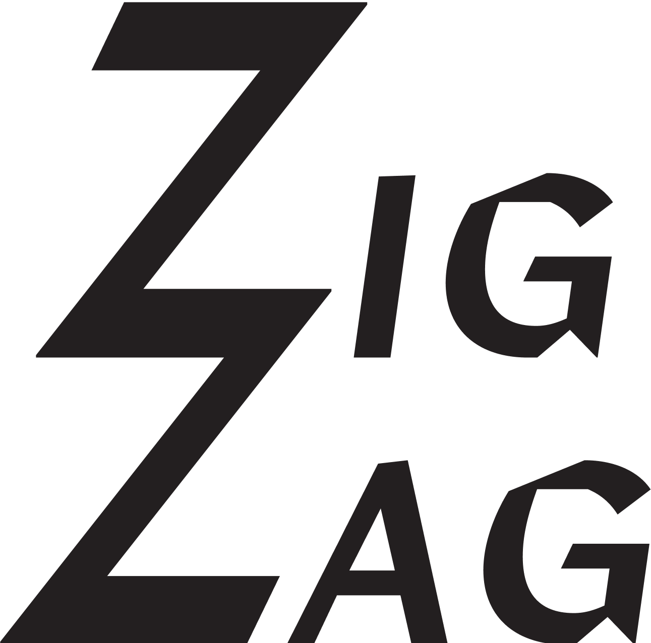
The cover logo was influenced by the shape and connected lines of a zig zag mark, with slight italics to show directional movement. The article wordmark was created from the winding shape of the river and the word wild in the title. The same effect is used in the page numbers to create consistency.
Article Layout + Typography
The article layout was pushed to connect to the visual keywords and the briefs request for unconventionality. Because of the flowing nature of both the river and the wordmark, it felt necessary to emphasize such movement with exaggerated rags and organic graphic elements.
In order to not distract from the layout design and the graphic elements, it felt necessary to select a legible and neutral typeface.


Photography
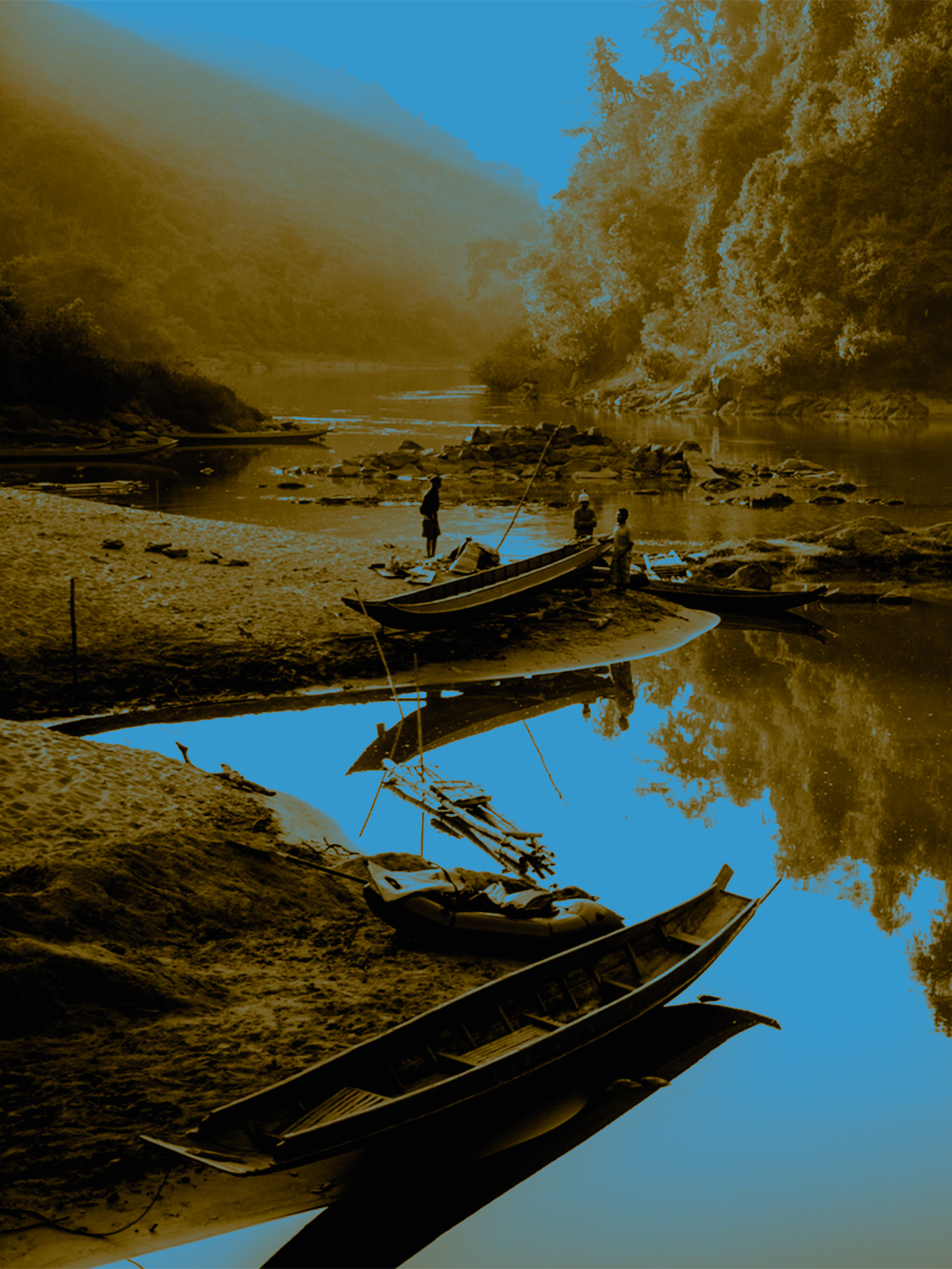
Journalistic imagery from photographer Ethan Welty’s trip to the Nam Ou River. The two-color gradient map was the chosen effect that connected to the clients past style and highlighted the river as the main focus.


- High contrast, high threshold colors.
- Blue specific to the color of the river boats, and contrasts the brown.
- Brown as an unconventional color for a destination article, and is the color of the river.
- Yellow, blue, and red combo was a direct inspiration from a timeout cover.
- Black and white used to create depth and legibility.

