Client
British Cycling
British Cycling
Discipline
Brand Identity
App Design
Logo Design
Naming
Brand Identity
App Design
Logo Design
Naming
Sector
Sports
Sports
RockFace is a customizable Mountain Biking App geared towards adventure, eduction, and community. Designed with grit, boldness, & simplicity in mind, RockFace has an inviting and flexible interface that supports the beginner, the pro and everyone in between.


Brand Key Words
Grit
Bold
Inviting
Grit
Bold
Inviting
Visual Key Words
Edgy
Confident
Straightforward
Edgy
Confident
Straightforward
Audience
Curious
Goal driven
Adventurous
Health conscious
Highly motivated
Passionate & tenacious
Curious
Goal driven
Adventurous
Health conscious
Highly motivated
Passionate & tenacious
Inspired by the shapes of rocks and organic flat forms. Individual profile as both the face of a rock, a mountain scape and the rock face one would bike on. Incorporating a sharp facial profile highlights the audience with the grit of the sport
Typography
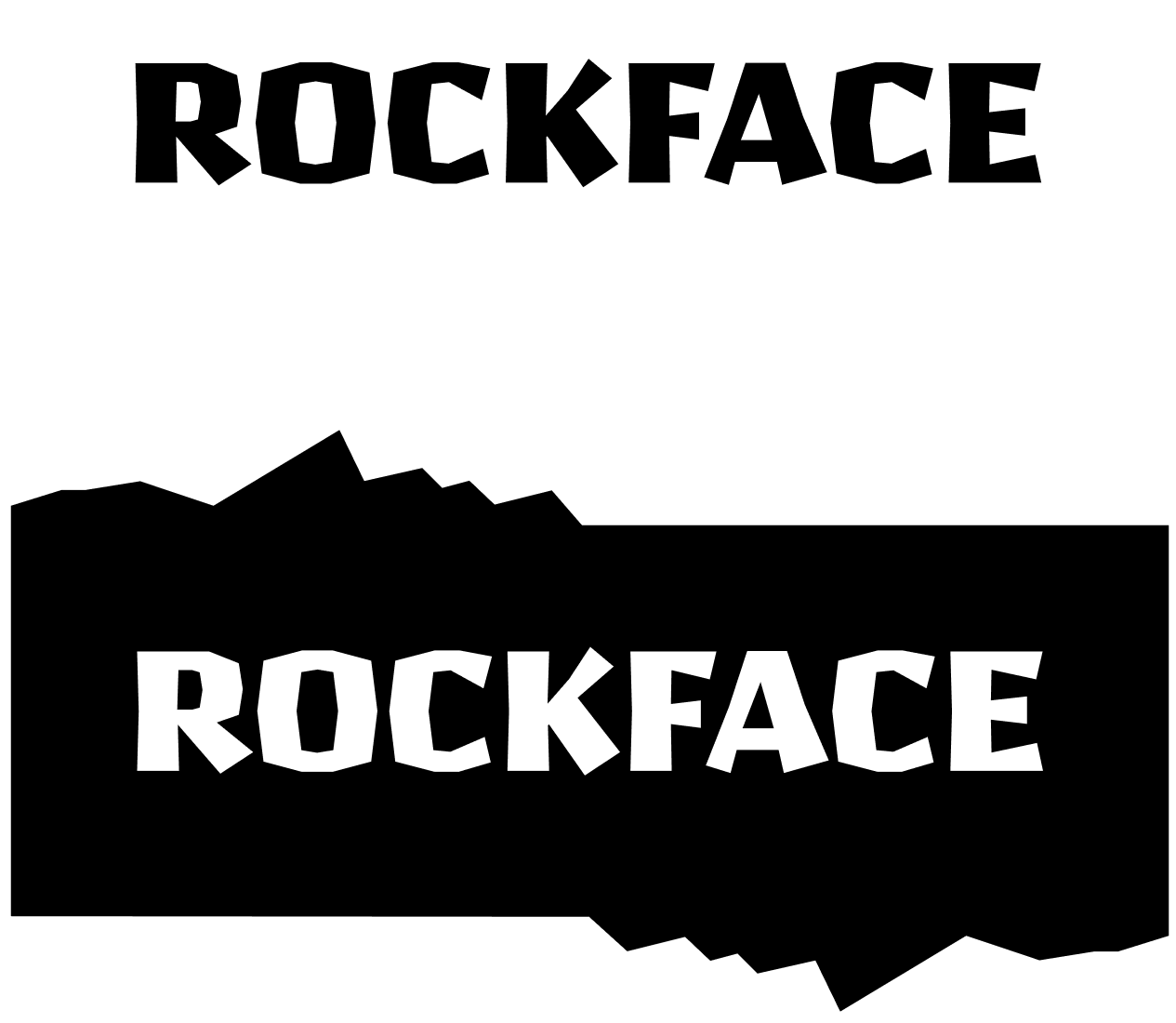
Pilsner black was used for the app headers and the wordmark for it’s organic geometric qualities that connect to the logo design. ABC Repro was used for all sub headers and body copy for it’s clean, and neutral design.


Photography
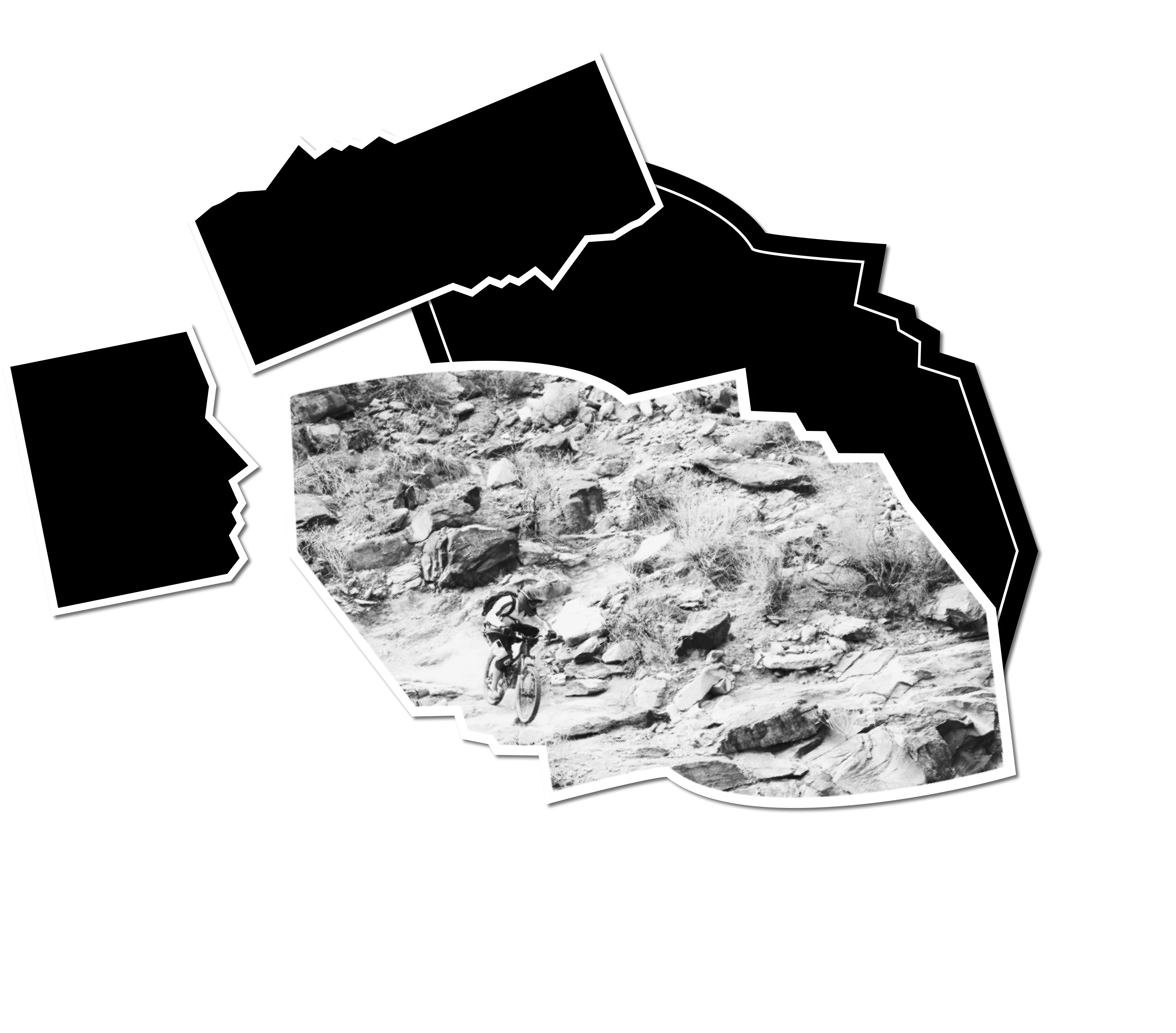
Beautiful professionally taken photos to entice riders. All photos are black and white until selected. Once selected, the photos are in color. This creates contrast, clarity, and reduces distraction from too many colors.
Graphic Elements
Organic rock shapes for buttons, for areas of emphasis, and for photos. This creates consistency throughout the brand.
Icons
Bold, a single color or black and white with thick strokes, inspired by MTB clothing and gear.

Color
- High contrast black and white, is simple, clean, easy to digest.
- Helps the user not feel overwhelmed and distracted. It’s tough, cool, and lets the imagery and text stand out.
- The yellow gold is a confident and joyful color meant to symbolize achievement.

