Client
Spider Wines
Spider Wines
Discipline
Packaging
Logo Design
Packaging
Logo Design
Sector
Food & Drink
Food & Drink
Photography
Colin Sussingham
Colin Sussingham
Spider Wines is a family run winery with 100 years of experience. To keep up with the times, they requested a new logo and set of labels, inspired by their motto: abstract ideas create sophisticated taste.


Brand Key Words
Abstract
Creative
Lively
Abstract
Creative
Lively
Visual Key Words
Bright
Natural
Superior
Bright
Natural
Superior
Audience
18 - 30 year olds
Hip young adults
Interested in art & design
Attracted to handmade objects
18 - 30 year olds
Hip young adults
Interested in art & design
Attracted to handmade objects
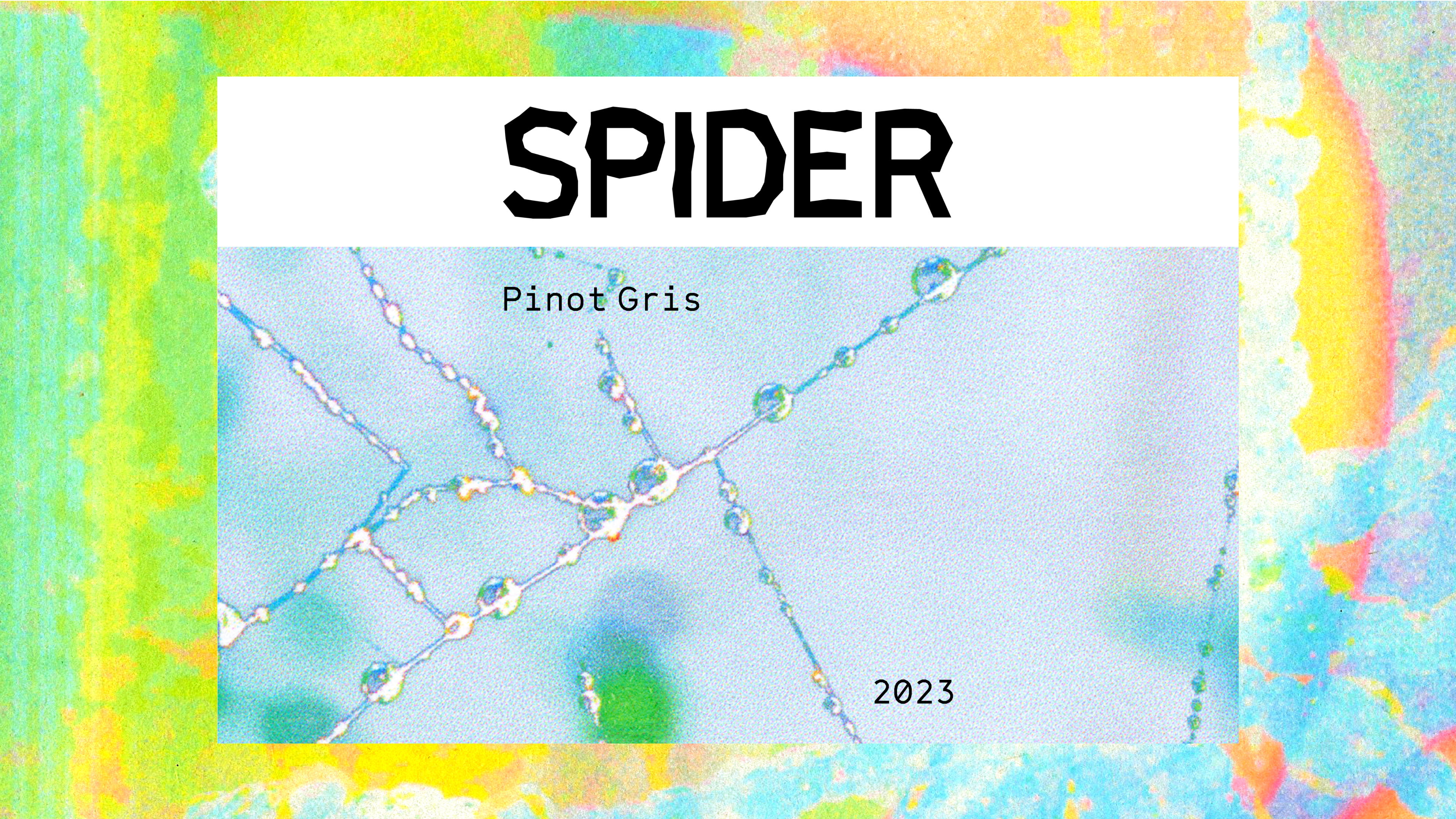
Label design inspired by the spiderweb photo taken and manipulated by photographer and my husband, Colin Sussingham. As a lateral and handmade approach, a beaded spider was made to emphasize nature and the title of the wine without using an image of a real spider. Both the beads and the web droplets create a jewel like effect that ties into the briefs request for elevated design.
Logo + Typography
Designed and selected for it’s geometric characteristics that mirror the edges of the beads
Color
A bright and lively color palette that feels young and playful.


