Client
SPAM
SPAM
Discipine
Brand Identity
Digital Design
Packaging
Logo Design
Naming
Brand Identity
Digital Design
Packaging
Logo Design
Naming
Sector
Food & Drink
Food & Drink
Photography
Colin Sussingham
Chris Bernabeo
Colin Sussingham
Chris Bernabeo
Despite being a cultural icon, and having a global cult following. SPAM still harbors negative connotations within the United States. A reminder of war and hardship or considered a cheap canned mystery meat. digneau (named after Ken Digneau, the man who named SPAM), aims to reach a different American audience, one who can ignore whats on the inside and focus on how the outside makes them feel.


Brand Key Words
Versatility
Excellence
Honesty
Versatility
Excellence
Honesty
Visual Key Words
Variety
Dependability
Transformation
Variety
Dependability
Transformation
Audience
All ages
Follows food trends
Interested in low cost
Desires convenience
Attracted to food packaging first
Enjoys low brow high brow combo
All ages
Follows food trends
Interested in low cost
Desires convenience
Attracted to food packaging first
Enjoys low brow high brow combo
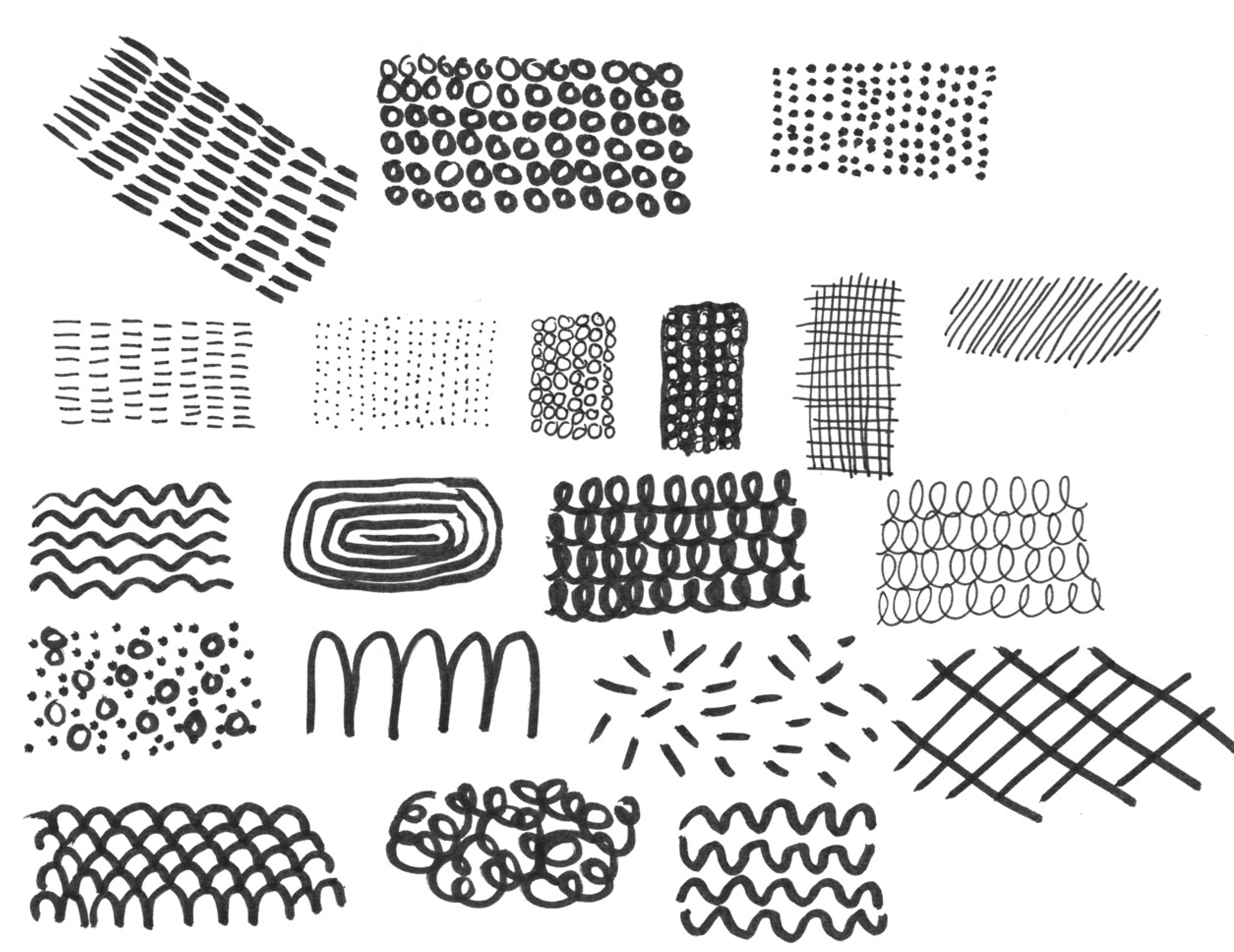
The handmade, homemade, and casual feeling of digneau was inspired by 50s - 60s SPAM advertisements, while the simplicity in color and shape nods to Swiss Modernism.
Logo
Informed by the shape of the SPAM can or the meat when its sliced. This rounded rectangle was used to develop a wordmark and logo with the same curvatures and density.
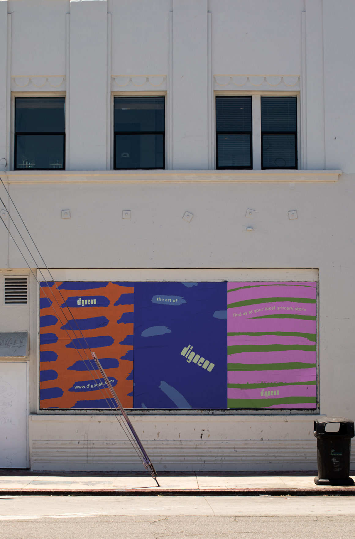
The stacked logo and the brands graphic elements were inspired by the concept of versatility and resourcefulness through pattern. The handmade marks and colors change within the shape to represent the creative freedom digneau provides, while the meat shape stays the same, thus evokes digneau’s dependability.
Typography
Maax Rounded was selected for it’s casual and inviting presentation. It’s not too serious or too silly, it feels modern and slightly hand drawn. Its lighter and thinner then the brand wordmark which contrasts it’s heaviness.


Photography
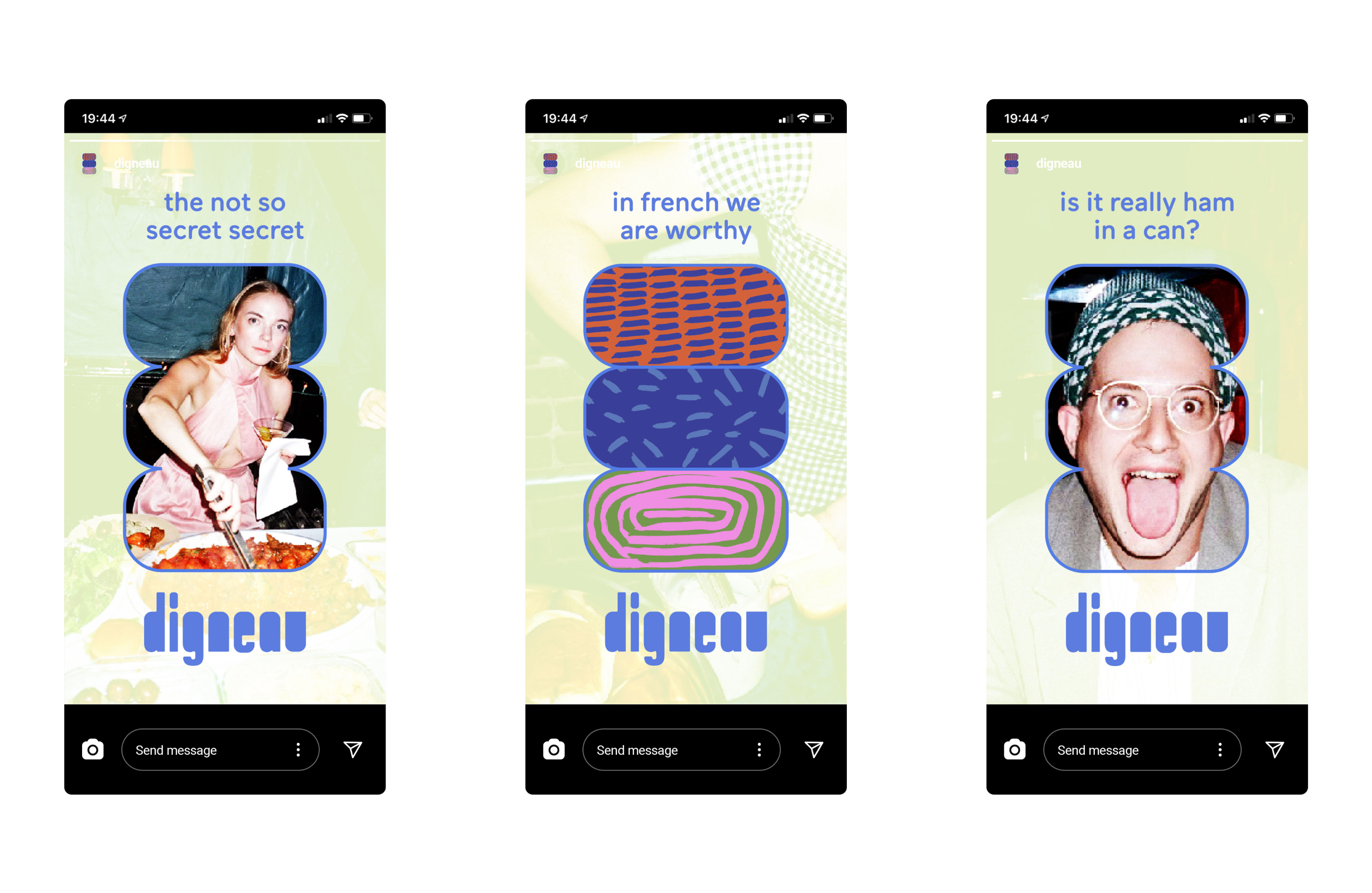
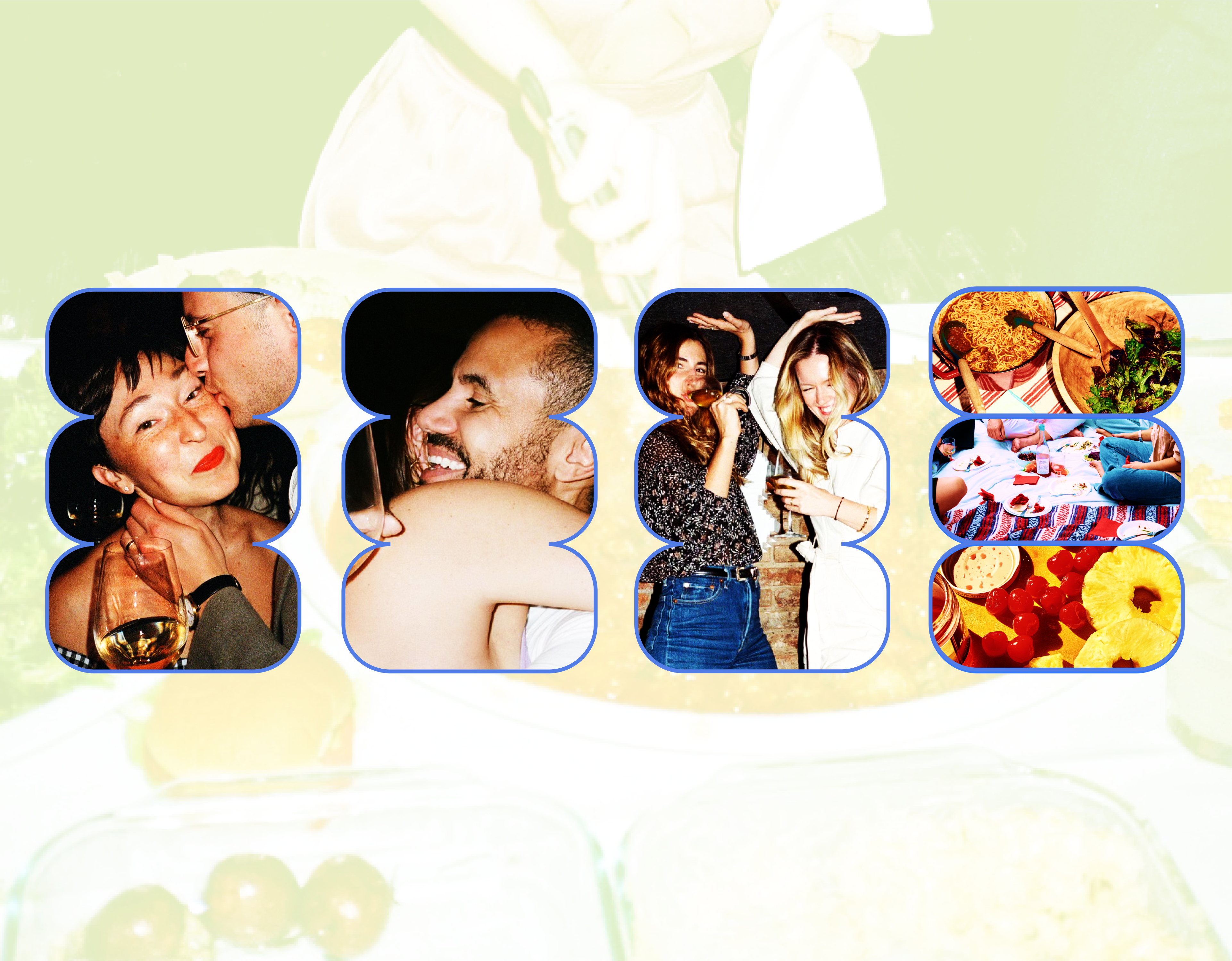
Fun, loving, quirky and candid photography gives digneau a casual attitude. As if to say, you can show up to a party or a picnic with a can or dish made with digneau.
The blue stroke that wraps around the imagery connects back to the logo, the brand colors, and adds contrast.
The brands lighter tones overlay imagery to create further depth.

Color
- Colors that don’t scream canned meat or ham.
- A palette that creates contrast no matter the combination.
- Feels friendly and inviting.
- Stands out on the shelf amongst other products.

